Friday, March 20, 2015

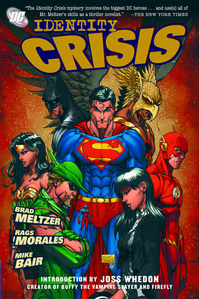
YALSA top ten GNs 2007: Identity Crisis


Identity Crisis 
Written by Brad Meltzer. Illustrated by Rags Morales and Mike Bair.
Published by DC Comics (2006)

[Note: The issues that made up this series originally came out in 2004, but the paperback edition of the collection didn't make it out until 2006.]

I remember back when this series was coming out there was some controversy as to how it treated the characters. It took characters who had been in the Justice League in the 1970s and 1980s and retconned things so that the old stories seemed a lot darker than they had been. I remember that I didn't really have any relation to those characters, so at first I didn't "get" what some of the criticism was. But I went and read issues of Justice League International (and similar series) out of quarter bins, and I soon grew to enjoy those old series and was kind of saddened by how the characters were treated in this series.

A decade later, I kind of wonder why on earth this series was put on a YALSA top ten list. The only real excuse I can think of, is that 2007 was the first year they created one of these lists, they didn't really know what they were doing, and that it was a big event comic (so of course it's good?), because fuck it is kind of terrible. So terrible it's been put on a list of the worst comics of 2000-2009.

So, what is it, and why is it so bad? It's a mystery where the "whodunit" turns out to be someone completely unrelated to all of the previous hints and clues, and whose personality was radically changed in order to make them the perpetrator. It's a superhero story with murder, rape, misogyny, and other horrible stuff done so as to "humanize" the characters. (Of course, none of that happens to any of the superheroes, instead it all happens to members of their family. To make them FEEL THINGS.) I'm not saying superhero comics can't tell deep, emotional stories that feature those elements, but doing it to Elongated Man (or whoever) seems to cheapen everything else they've done. Superhero comics basically work on suspension of disbelief, and this comic seems to go out of it's way to break characters and make you realize how nonsensical the DC universe is. It has superheroes doing things that they they seem like assholes, and the problem with shared universes is that the characters and stories don't exist in isolation. Someone else is going to use the characters later, and they'll have to deal with this stuff.

You'd think Meltzer might understand that as one of the reasons he wrote this comic was to explain why Dr. Light was a terrible villain in the comics he read as a kid. He had to do this in a "realistic" way, making things grim and gritty, and ignoring the facts that pretty much everyone was a terrible villain back then and that they're superhero comics. It's not always appropriate to make characters do "realistic" things.

Okay, let's talk about Women in Refrigerators. This is a term (created by comic writer Gail Simone) to describe the many, many terrible things that happen to women characters in comics, frequently just so that the main (male) characters can have something bad happen to them without it actually _happening_ to them. The titular case was when a Green Lantern came home to find that his girlfriend had been killed and stuffed inside his fridge.

Identity Crisis does this in spades. Sure bad things happen to some male characters too, but even in death the female characters seem more screwed over. I mean, why be killed by a boomerang when you can be raped, and then killed, and then set on fire?

The last year or so has really seen an increase in comics that feature female leads, which is great, but reading something like this makes me wonder how long it is until Ms. Marvel gets raped or has her arms ripped off or something. A lot of writers, editors, and other people involved in comics seem to think that superheros need to be dark and gritty and...terrible. I wish they'd stop.

There was recently a controversy over an alternative cover for an issue of the Batgirl series currently coming out. Some fans felt (rightly so) that the cover (which heavily suggests sexual assault and can make Batgirl look like a victim) was inappropriate for the type of book that Batgirl is. I agree. Regardless of whether you think the cover is a good piece of art, you can't take it out of context. You have to view it as a cover for a comic, and consider what the contents of that comic are going to be. People (and there seem to be a lot of them) who say "No! It's a great cover! It's creepy and well drawn." are missing the point. It's not whether it's good, it's whether it's appropriate for it's context. A lot of people seem to feel it's appropriate for Batgirl, and I wonder what other comics they'd have been fine with this cover being on. Batman Adventures? Scooby Doo? Tiny Titans?

The reaction of those fans makes me pretty sad. So of course you'll all be happy to know that a tenth anniversary hardcover of Identity Crisis came out in December of last year. I'm sure a lot of fans love it's "realistic" take on superheroes.

Thursday, March 12, 2015

YALSA top ten GNs 2015: Through the Woods


Through the Woods
Written and illustrated by Emily Carroll.
Printed by Margaret K. McElderry Books (2014).

If you asked me I'd say that I don't like horror. I don't read horror books. I don't watch horror movies. I think being scared is...scary and not fun. And yet, if I gave you that response I'd be lying to both of us.

Sure, I don't like horror movies, unless you set it on a space station and put an alien in it. I don't read horror books, except for all of that HP Lovecraft stuff I've read to play Call of Cthulhu. I'll play horror video games (I stopped playing Dead Space because my partner said the sounds freaked them out). I'll apparently spend hours reading about unsolved mysteries on the internet and terrifying myself until I'm scared to move or look behind me. And then, of course, there are the horror comics.

I'll _still_ say that I don't like horror, but if you ask for my list of favourite comics ever you'll find Uzumaki by Junji Ito on that list (review coming to this site some day!). I've read and enjoyed numerous other horror manga (by Ito and other creators), I own reprints of old horror comics, and I know there's at least one other horror comic on my shelf (and possibly more than that).

By reading the above you can probably guess that Through the Woods is a horror comic. Just by knowing that you know more than I did when I started reading this comic, because I figured it was going to be fairy tales or something. It's, uh, not. Or rather, I suppose it is scary and terrifying like some fairy tale stories can be.

Carroll is best known, perhaps, for Face All Red, a short horror comic that she put online several years ago. I remember reading it then, and thought that while pretty creepy, it wasn't as big a deal as other people seemed to think. That story is included in this volume, and I feel pretty much the same way about it now as I did then.

However, I feel differently about the other stories in this volume. Some of them are incredibly creepy, spooky, or scary, and one even had me scream out loud a little on a page turn reveal that was kind of body horror. (And fuck, that stuff really freaks me out sometimes. Or pretty much all times.)

The stories are set in various periods of "ye olden days", with the most recent being set at some point after cars become fairly common place (it really doesn't matter when). (And something I didn't realize until I was flicking through the book again just now, is that the vast majority of these stories all have female characters in the lead role.)

Carroll's art is pretty great. Though I'm apparently incapable of saying much beyond that. Her use of page design (very few panels have straight, defined borders),  and colour is really great, and show how much effort went into creating the mood in these comics.

Overall the production of the book is really quite nice, with the thick glossy paper used allowing the colours to pop off the page. Similarly, much of the art is full bleed, which means it's printed right up to the end of the page (and I was reading a comic from the '90s recently where this was presented as a big deal). Because of these factors, plus the styles used for the art and lettering (the whole comic is hand lettered and the words can really feel like part of the artwork), Through the Woods sometimes reminded me more of children's picture books than of any other comics.

I'm not going to explain the plot of any of the stories in here, as I feel they're almost of second importance to that of creating creepy atmosphere. But even if not, it seems almost unfair to tell you what's happening in these stories, as it could ruin the surprise for you if you choose to read this comic.

This is a beautiful comic, and parts of it are going to haunt my memory (in a terrified way) for a while. Still, I'm glad it's on this list because I hadn't heard of it before, and despite the fear, the scary imagery that will not leave my brain, and the possibility of trouble sleeping in the future, I'm happy to have read it.

Tuesday, March 3, 2015

YALSA top ten GNs 2012: Wandering Son


Wandering Son (Volume 1)
Written and illustrated by Takako Shimura.
Published by Fantagraphics (2011).

As a guy that owns...5 dresses, I can understand some of the uncertainty and fear of social stigma that Shuichi Nitori, the main character in Wandering Son, faces. However, if I'm wearing a dress it's at least partially because I'm trying to undermine gender stereotypes (and, yes, because a lot of boy clothing is really boring). Shuichi on the other hand actively wants to be a girl, which is a very different scenario, especially when you're ten years old.

This first volume of Wandering Son features Shuichi very slowly coming to terms with this idea. So slowly in fact that I don't think it's even explicitly mentioned until the second chapter. At the beginning he's kind of terrified by the idea, scared and embarrassed that other people might find out, and just really not sure what to do. Thankfully, he encounters other students who are either supportive, of a similar mindset, or both, and gradually begins to experiment with wearing dresses and other things.

The first volume also features an interesting comparison, as we meet one of Shuichi's friends, Yoshino Takatasuki, a girl who wants to be a boy. At one point while they've both dressed up and gone out, she starts her period (for the first time), which while it seems like it should be a horrible, awkward nightmare, somehow doesn't turn out that way. Either way, it does support the back of the book where it states that the characters are on the "threshold to puberty". I think the kids in this book are at the age where they start developing their own sense of identity, and I'm curious as to how they grow over the rest of the series. There are 14 more volumes, in which he characters age until they graduate from high school and head off to university, however, only about half of them have been translated into English.

Shimura says in the bonus manga in the back that her "characters are hard to tell apart, [her] backgrounds are too empty, and [she] has a million other flaws to overcome", but I think she's being overly self critical. Yes, there are a fair number of panels that lack backgrounds, but it never really bothered me, and sometimes the use of screentones or solid black or white as backgrounds actually manages to add to the scene by complimenting the emotions of the characters. As for the characters, they are fine, good even! It's a comic about 10 year old kids, and for the most part they seem to look like 10 year olds (I think... I don't really have much experience with them...). I'm not going to proclaim that this is my favourite art ever, but I've read many comics (this year) that have worse art than this, and apart from an awkward scene change or two, the art here generally works.

One aspect of the art that I did enjoy is the use of screentones. I guess part of this is that they are pretty common in Japanese comics, but decidedly less so in Western ones, and since I don't read as much manga I'm not as used to seeing them. However, their use on clothing is effective, giving the illusion of texture and colour.

I was just reading about the controversy surrounding the book When Everything Feels Like the Movies, a book about a young trans character, and the fact that there is controversy at all, let alone the situation surrounding the tragic events it was inspired by, kind of show why stories like that, and like Wandering Son, should exist. There are, unfortunately, still quite a few people who are homophobic or transphobic (amongst other things), and these people can make the lives of young people miserable.

There's a reason why suicide amongst LGBTQ youth is high, and thankfully there are groups who strive to improve the lives of those people and educate both them and the future. One thing that can help is providing youth, both those identifying as LGBTQ and those that don't, with material that shows queer lifestyles as normal. The last decade has seen a fairly major increase in LGBTQ characters in comics, and also an improvement from how they used to be portrayed. However, they're still underrepresented, and it never hurts to have a few more. So yes, I can see why Wandering Son was on YALSA's lists of top GNs, and I support it being there.

Sunday, March 1, 2015

Terry Fox Library


Forgot I didn't post these. I went to this library back in January and picked up a pile of books. Must read all the comics.


Monday, February 23, 2015

YALSA top ten GNs 2009: Pitch Black


Pitch Black 
Written and illustrated by Youme Landowne and Anthony Horton.
Published by Cinco Puntos Press (2008).

If most people were approached by a large, black, homeless man on the New York subway they'd probably attempt to avoid any sort of conversation and possible even just get off the train entirely. But for whatever reason Youme Landowne didn't. Instead she met Anthony Horton, and spent a lot of time talking to him about art, life, and homelessness.

Vancouver (where I live) is like many cities in that it has a large homeless population. And while the Downtown Eastside might seem pretty terrible, it really can't compare to some of the places around the world. However, even when I see and am aware of homeless people in the city, it can be really easy to ignore them, or forget that they are humans with feelings, emotions, and pasts. (Though to be fair, I can forget about that for pretty much any human, homeless or not.)

Compared to many Horton seems to have had a pretty terrible life in a lot of ways, and the cards were clearly stacked against him from the start. He bounced around foster homes after his parents gave him up, and never learned to read or write or any other real skills.  He spent some time living in shelters, but found them worse than living outside. Eventually he found his way down to the subway tunnels, where he encountered other people, and made various homes for himself over the years.

In Pitch Black he shows Landowne where he lived, talks about his rules for survival ("Remember, anything you need can be found in the garbage"), and tells her about his friends who had helped him survive. In it's attempt to humanize Horton it manages to be sad, terrifying, and touching in equal parts.

The art by Landowne is not something that would work with a lot of stories. It seems to be lacking a lot of the detail and consistency that I associate with "good" comic book art. But somehow the thick, wavy panel borders and lines, the grey smudgy colour, and the art that sometimes feels as though it were cut off by the edge of the page does a good job of capturing what the underground tunnel system is like: grimy, claustrophobic, and dangerous. It doesn't look clean and it doesn't look safe, and thankfully due to this Landowne manages to avoid making living in subway tunnels seem appealing. (I mean, doesn't everyone want to do that?)

At about 60 pages this book is not that long, and the art is not the best by most standards, but as a whole the comic does manage to capture some of what it feels like to be homeless. Reading Pitch Black can help you understand how difficult life can be for some people, but also that no matter who they are people are still people and still have wants, needs, and rights.

After reading this comic I'd hoped that Horton had managed to improve his life to some extent, but  it seems as though up until his death in a fire in 2012 he continued to be homeless. Not exactly the uplifting note you want a story like this to end on, but sadly, real life doesn't work that way.

Tuesday, February 17, 2015

YALSA top ten GNs 2009: Cairo


Cairo
Written by G. Willow Wilson. Illuastrated by M. K. Perker.
Published by DC/Vertigo (2008)

It's kind of interesting to go back and read someone's first published work after they become super famous (well... relatively super famous). Wilson is now (by far) best known for her work on Ms. Marvel (which was on this year's YALSA top ten GN list), but back in 2007 she was writing for Vertigo.

I owned the first volume Air (the series Wilson did at Vertigo after Cairo), and while I even talked to Wilson at a con I don't believe I ever actually read it. I had actually read this book before, which seems kind of strange to be honest. Air lasted 24 issues, which by the records of Vertigo series from the last decade or so is actually pretty good.

As for Cairo, well, it reminds me of an action movie. Not a "shoot them until everyone is dead" movie, but a "lots of disparate characters running around doing different things while other people shoot at them" movie. There are six main characters in the book, who get thrown into random pairs as they circle events about a hookah that has a djinn/jinn/genie inside it. A male drug smuggler who's trying to get the hookah back ends up with a female Israeli soldier who just wants to go back to Israel without getting killed. A young, white American girl on holiday and an Egyptian journalist get kidnapped as hostages and have to escape. And there's the young, male Lebanese-American who was going to be a suicide bomber until his flight got cancelled and he ended up trying to help a jinn.

They run around Egypt trying to find each other, escaping bad guys (wait, an Israeli soldier, a potential suicide bomber, and a drug smuggler count as good guys?), encountering magic stuff and entities, and fighting goons and/or monsters. The difference between this and other stories is that it was made by Muslim creators, and thus their knowledge of and experience with other countries/cultures can create a different world (though considering that Wilson converted to Islam like five years before this book came out you might want to question the accuracy of everything).

As for the art by M. K. Perker (who also drew Wilson's series Air), it didn't really grab me. The layout is fine, the panel to panel story telling works, and there are even a couple of pretty fun fourth-wall breaking bits. However, I think that at the time this comic came out Perker was a lot more used to editorial cartooning (at least that's what I can surmise from his Wikipedia page), and I suspect drawing a full 150 page graphic novel was quite a different experience for him.

Looking through Cairo again I think my major problem is with the faces of the characters. They look kind of awkward? Maybe that's not the right word, but it seems as though their features, while expressive, don't always fit on their faces right, as though they were the wrong size. Now, just to clarify, this isn't always the case, and their are times when the characters are supposed to look kind of weird, however it does happen just enough for it to be noticeable by me. Looking at his work since then, Perker doesn't seem to have this problem anymore (his stuff for The Unwritten looks really nice), so I think it was just inexperience.

Looking at the YALSA lists you have to remember one thing: these are not the "best" books of the year, these are "great graphic novels for teens". I think that means that there's a greater emphasis on teenage characters, but also on non-white characters, LGBTQ characters, and other people who are generally underrepresented in our media as a whole. Librarians are far more likely to think about those sorts of things than the Eisner judges (who, while they generally pick very good books, have also only ever chosen comics about white people or animals to win their "Best Publication for Teens" award). For librarians it's important to help people find books that appeal to them and feature characters like them, but also provide books that represent different viewpoints than library users have experienced before. On that level, I think Cairo probably succeeds, at least in an "action movie" kind of way.

Friday, February 13, 2015

Library Tourism: George Mackie Library

I like to visit different public libraries. It's fun!

However, I also go waaayyy out of my way to visit public libraries because the systems here won't do interlibrary loan for graphic novels. So if I want to read something that's out of print I'm going to be getting on a series of buses.

And so I headed to Delta (where?) to visit the George Mackie library branch of the Fraser Valley Regional Library.

I caught a bus (the wrong bus), waited forever for another bus (because of an ice hockey game delaying buses), caught the skytrain, discovered that the every half hourly bus I needed had left two minutes before I go there, got on a different bus that was heading in the vaguely same direction, and then walked a bunch. Only took an hour and a half to get there.

Then I borrowed 23 graphic novels. Good thing I brought a backpack.