Showing posts with label reviews. Show all posts

Monday, January 25, 2016

YALSA top ten GNs 2012: My Friend Dahmer


My Friend Dahmer
Written and illustrated by Derf Backderf.
Published by Abrams Comic Arts (2012)

To be totally honest, I had absolutely no interest in reading this graphic novel about Backderf's experiences growing up with the murderer Jeffrey Dahmer. While I'm aware that there's a lot of interest in true crime and serial killers, it's really not an area in which I find myself particularly interested. Despite this lack of interest, and the unsettling content, I found myself enjoying My Friend Dahmer far more than I had expected. However, be forewarned, this is an incredibly depressing look at someone's real life spiral into a nightmare.

Backderf went to school with Dahmer throughout junior high and high school, and interacting with him on a peer level gave Backderf a different take on Dahmer than many of the adults in his life. However, while the title of the book implies that they were friends, the reality is far more complicated. Backderf (and his actual friends) may have found Dahmer to be at times entertaining, and encouraged him to act out in public, but while they used him as a sort of mascot they weren't people who really interacted much outside of school.

Throughout the book Backderf makes sure to repeatedly say that he does not not want to make Dahmer into a sympathetic character, and that while Dahmer's home life had many problems, it in no way excused his later actions. The Dahmer that Backderf knew was an incredibly troubled youth, who seemingly isolated himself in a way to deal with the terrifying thoughts that were constantly filling his mind. Dahmer spent much of high school drunk (in class!) and yet apparently not only did no teacher ever notice, but Dahmer managed to graduate (and briefly went to university). In some ways this book can be seen as a criticism of Dahmer's teachers and parents for not noticing that something was horribly wrong with him.

Backderf's art style is in no ways realistic, but he manages to capture the characters in a way that shows off who they are. The almost cartoony/caricatureish art gives characters the opportunity to express the emotions that they're feeling (and contrasts with Dahmer's frequently emotionless face), but is also effective at creating a sinister atmosphere during the more unsettling parts of the book.

In addition to his own personal recollections, Backderf interviewed dozens of his former classmates and teachers, and extensively used interviews, news articles, and other sources to create as accurate a timeline of events as possible. Despite his copious research a problem I had with this book (and, it seems, many of the nonfiction books I've read that have been on the YALSA lists) is a lack of context. While the text frequently alludes to what Dahmer ended up doing, it is only in the footnotes in the back, and the blurb on the inner front of the dust jacket (which I missed) that it actually says what he did (Dahmer killed 17 people). And sure, how many people are going to pick up this book and read it (and not read the blurb) without knowing anything about Dahmer? Probably not many other than me. Still, I think it would have been valuable to include in the introduction.

Saturday, December 19, 2015

YALSA Top Ten GNs 2012: Zahra's Paradise


Zahra's Paradise
Written by Amir. Illustrated by Khalil.
Published by First Second (2011)

As of this moment I have read 482 graphic novels this year. Yes, that is a completely absurd number. Yes, I am insane.

The perhaps more interesting number is "1". That is the number of graphic novels I have failed to finish this year. Considering the quality of some of the stuff I have finished, that there was only one graphic novel I didn't finish seems to indicate that it was truly terrible. Except it wasn't. The book in question was fine, I just couldn't face reading any more gothic literature after it being chosen as that month's genre for my book club.

However, if I wasn't reading it because it was on a YALSA top ten graphic novels for teens list (and for some reason I'm trying to read them all) I never would have finished Zahra's Paradise.

The plot at first claims to be about a mother finding her son after the the political protests which happened in Iran in 2009, and there are places where the book seems to be from her point of view, but for the most part it seems to be about her other son. Of course, it doesn't help that both characters are complete ciphers and that we learn basically nothing about them, their feelings (beyond "this situation is not good" in regards to the arrests after the protest), or their interests. The missing brother is better developed, but at the same time the book takes a strangely long amount of time telling us about how much he loves ice water. I'm also really not fond of the main young female character, who seems both politically active (helping to uncover government secrets), and weirdly naive.

Of course, this book tends to take a long time to tell you anything. It is densely written, and almost every page is filled to bursting with words. In some comics this is fine, but here it really seemed like I was slogging through dialogue and character's thoughts that didn't add very much to the story. I think this demonstrates Amir's background as a journalist, since overwriting comics can definitely be an issue for those coming to the medium from more prose heavy ones. (Show don't tell!) Despite the general wordiness of this comic, it also seems to leave out a lot of background information that would help people (especially young people) make sense of what's going on (and why).

Another problem I had concerning the writing was the number of foreign words used in this book. That's a pretty common thing to see, and it's normally not that big of a deal, but despite having footnotes translating some of the words and _two_ glossaries there were still words and cultural references the meaning of which I had no idea. (Though admittedly, reading the glossaries probably gives you the best context for Iran's political system.)

In comparison to the writing, the art by Khalil is actually pretty good. I don't think I ever had problems following what was going on, and I appreciated the hand lettering (which I assume he also did, nobody else is credited). The combination of the art and lettering styles reminded me of old Mad Magazines, which is a little disconcerting when you consider the content of Zahra's Paradise. There are also some pages that I think look really great (see below), but more in the way that political cartoons do, making me wonder where most of the artist's experiences lie.


I can understand why this graphic novel made it onto the YALSA list: it was fairly topical at the time, it exposes people to other cultures and ways of life, and its plot is centred around a young person. But, I don't think it manages to provide enough context for people to understand the whys of the story, and fails at making the characters seem human enough to care about. If you want to read a graphic novel dealing with Iran's political climate you should read Marjane Satrapi's Persepolis, and if you want to find out more about the 2009 political unrest in Iran, well, there's always the Wikipedia article.

Wednesday, November 25, 2015

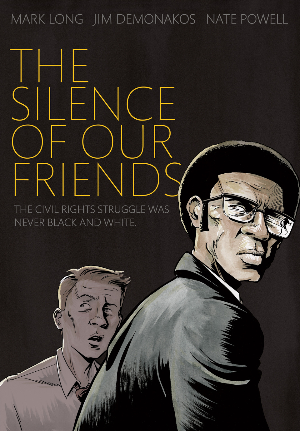
YALSA top ten GNs 2013: The Silence of Our Friends


The Silence of Our Friends
Written by Mark Long and Jim Demonakos. Illustrated by Nate Powell.
Published by First Second (2012)

I actually kind of hate comics like this. Not because they're bad, but just because they remind me of how horrible people are. And yeah, sure, sometimes it's good to be reminded, but I guess I already think people are horrible so much of the time.

The Silence of Our Friends is set in 1960s Texas which, if you were unaware, is super racist. The story focuses on two families: one white and one black and...I don't know if it's even worth explaining. People are racist, the white family tries to become friends with the black family, people are racist, there's a civil rights protest where the police shoot at people a bunch, people are racist, there's a trial where black people are accused of shooting at the cops, people are racist, etc. People were horrible, though not everyone was horrible. Also, people were horrible in different ways. Maybe some hope. The end.

I dunno. Nate Powell's art was pretty nice I guess, but while I can appreciate his art and understand that other people really like it, I've never found it that appealing. I understand why this is on an American list for best graphic novels for teens, because it is important that people (especially young people) learn about what happened in the past (or they are doomed to repeat it, etc.), but I guess I'd rather just read comics about giant robots beating each other up. I guess that is the way in which I am horrible.

Wednesday, November 18, 2015

YALSA top ten GNs 2013: A Flight of Angels


A Flight of Angels
Conceived and illustrated by Rebecca Guay. Written by Holly Black, Bill Willingham, Alisa Kwitney, Louise Hawes, and Todd Mitchell.
Published by Vertigo (2011)

Rebecca Guay is an artist who I mostly know from her Magic: The Gathering cards. Her cards have a pretty specific style, and it's one that I enjoy.


Despite this, I don't think I've ever read any of her comic work. In fact, I had no idea she even had comic work until just now when I looked it up. And while seeing that she drew the Black Orchid Vertigo series doesn't really surprise me, it did seem a bit strange that she drew a Green Lantern comic (though that specific Green Lantern comic seems like it might fit her style fairly well).

While it seems obvious now, I had not expected A Flight of Angels to feel like a throwback to the earlyish days of Vertigo.  For a long time Vertigo (the imprint that published this comic) was best known for Sandman and Sandman like things (e.g. fantasy stuff about stories). This was no doubt helped by the fact that Sandman was their biggest seller, Neil Gaiman has a huge following, and that after Sandman ended there were a plethora of spinoff series such as The Dreaming, Lucifer, and so forth. But at the time Vertigo also put out a lot of (at least vaguely) similar titles, to various degrees of success. Eventually Vertigo shed this perception, and now they're known for...uhm, I dunno. Publishing lots of different stuff that doesn't sell that well?

A Flight of Angels is a series of short stories about angels in various settings, with a framing sequence set in some vague fantasy world. There are angels in the garden of Eden, angels in modern day cities, angels in a fairytale version of olden days Russia, angels in Victorian England, and angels in Heaven. For the most part I didn't care. The stories range from "that was pretty okay" to "I forgot that was even in this book".

However, I suppose the stories aren't really the main selling point here, that would be the Guay's art. It is not my favourite comic book art ever, but at the same time I can see it being the favourite of someone else. All of the art in this volume is painted by Guay, and she changes styles between the various stories. Each style manages to effectively capture the feel of the story it's illustrating. Some of the individual panels are also really nice, but for whatever reason they didn't really stick in my memory.

One final complaint: the lettering in the story set in Russia features Cyrllic characters used instead of English language ones. I find this annoying (mostly because I actually know the Cyrllic alphabet). This story also used other...questionable fonts, which surprised me considering the book was lettered by Todd Klein, but I guess everyone has off days.

If you like the sort of Vertigo fantasy stuff I mentioned earlier, you would probably enjoy this book. I didn't. That's not to say I don't enjoy Vertigo fantasy stuff. I loved Sandman, and it's one of the reasons I still read and love comics. But I could never get into most of the spinoffs and related titles, and A Flight of Angels seems as though it could easily be one of the ones I didn't enjoy.

Wednesday, October 14, 2015

YALSA top ten GNs 2015: 47 Ronin

47 Ronin
Written by Mike Richardson. Illustrated by Stan Sakai.
Published by Dark Horse (2014).

Hey! Now I've read all of the 2015 top ten GNs! Of course I've only reviewed half of them, but that's because I'd read the other five before the YALSA list was announced.

I started this project (long ago) because I was looking at a list of YALSA top ten graphic novels (for 2013 I think) and realized I hadn't read any of them. As someone who reads a lot of comics, and who intends to work in libraries, that kind of bothered me. Shouldn't I have read these? Or at least know what the are?

So my initial goal was just to read all of the YALSA top ten graphic novels (or at least all of the ones I could find), and I read a bunch! But then I realized it might be a better project if I also reviewed them. That would help me figure out what made a good graphic novel for these lists (and for library collections).

Of course, it really shouldn't have taken this long (I think I've average 1.5 reviews a month since I started), but I guess I'm a huge slacker. Still, it's nice to have something to force me to write stuff other than Two Fisted Librarians.

The story of the forty-seven ronin is one that is well known in Japan. It's based on a real event that happened in the 18th century (here's the Wikipedia page) that has been adapted into various media multiple times, and shows the complete and utter insanity and stupidity of codes of honour.

Lord Asano is summoned to the shogun's court in the capital. He journeys there, but before he can begin his duties he has to learn proper court etiquette. He's taught by Kira, a court official, who while a good teacher, is also pretty corrupt. He demands a bribe from Asano, but Asano refuses to pay. Kira then begins to act in ways so as to lead to Asano appearing foolish in front of others. He doesn't tell him that meeting places have been changed, he claims to have given different instructions than he actually gave, and he finally just insults him in front of other people. Asano manages to keep his cool for a while, but eventually  is driven too far and freaks out, attacking Kira with his sword.

Now, the attacking might have been justified, but apparently drawing your sword in the shogun's palace for any reason is punishable by death. There is a overly quick investigation into the incident, Asano commits ritual suicide, and his holdings are seized by the government. The samurai who worked for Asano want revenge, but are convinced by Oshi (who had been Asano's right-hand man) to wait until the right moment to strike.

[Spoilers follow.]

After a couple of years they accomplish their goal after some misdirection (pretending to be drunken idiots, etc.) and kill Kira. Then all 47 of them surrender, and they are given the option to die an honorable death and commit ritual suicide. As interesting a historical story this may be, it really just indicates to me how completely and utterly insane Japanese culture was (and is?).

The idea that because of committing a "shameful" act you should kill yourself is stupid. But I can't say "these characters act like idiots so this is a bad book" because these are events that actually happened. The story is well told, and all of the relevant details appear to be included (though I'm not sure how much people with absolutely no knowledge of 18th century Japanese culture would have trouble understanding).

The real important part of this comic is the artwork, by Stan Sakai. Sakai is best known for his creation Usagi Yojimbo, a samurai rabbit character that he's been creating adventures for since 1984(!). He's written and drawn more than 200 issues of Usagi Yojimbo, but 47 Ronin is (by far) the longest project he's ever drawn that he didn't also write. If you're familiar with Usagi Yojimbo you'll know that Sakai is really good at drawing cartoon animals having samurai adventures. In fact, it's kind of weird seeing him drawn humans in this story, but it doesn't take away from the quality of the artwork.

Sakai's art is never going to be mistaken for being incredibly realistic, but even with the lack of detail (people generally just have dots for eyes) what is there is capable of showing a lot of range. The facial expressions and body language in his characters is capable of conveying a lot of information, and their actions seem natural and not posed. Sakai has also clearly done a lot of research into the buildings, clothing, and events from this time period, and while I can't say it's all accurate, it definitely at least feels accurate to me.

The historical event this comic is based on is incredibly stupid, but this version of the story was clearly created with a lot of care, craftsmanship, and attention to detail. If you want to read a samurai comic that's not excessively bloody, this one is worth reading. Though really, I think I'd rather just read more Usagi Yojimbo.

Saturday, September 26, 2015

YALSA top ten GNs 2013: Stargazing Dog

Stargazing Dog 
Written and illustrated by Takashi Murakami.
Published by NBM (2011).

Have you heard of Into the Wild? It's about a true story about a guy who wandered off into the Alaskan wilderness and died of starvation. Some people probably think it's romantic. Stargazing Dog is a somewhat similar story, except told from the point of view of a dog.

To put all of my biases up front, I don't really like dogs, and this comic kind of provides examples of why. Specifically, their personalities and apparently unending loyalty are not things I view as positives (though I am aware that many other people do). So a comic told from the point of view of a dog (and not an incredibly intelligent one) that seems to in part about how great that loyalty is has an uphill battle with me.

A girl finds a puppy, and convinces her parents to adopt it. Like most children, she soon pays little attention to the animal and her parents end up taking care of it. The human father, referred to as "Daddy" by the dog, seems to spend more time hanging out with, and talking to, the dog than he does to his wife and child. Eventually, he loses his job, loses his family, and goes off on a doomed road trip where more bad things happen to him and he dies (not really a spoiler, since it's revealed on the first page).

What really pissed me off was the afterward, where Murakami stated that his reason for creating this comic was because:
"In the past, he ["Daddy"] would have been an ordinary, good father.
However, in today's environment, it's adept or die. And that's not right. I really feel fed up with this hideous situation."
And really? Fuck that. He may have been an "ordinary" father, but in no way was he a good one. He paid no attention to his wife or child in any way, and was so uninterested in their lives and feelings, that he is shocked when his wife wants a divorce. That's hardly a "good" father in my eyes (though maybe it says something about Japanese society and familial expectations).

The back cover says that this is an "inspiring" story, but I'm not sure how I'm supposed to be inspired. A guy doesn't get his own way, so starves to death in the middle of nowhere while condemning an animal to the same fate? The message seems to be that if things aren't going your way you should leave everything behind, never ask anyone for help, and die because you're incredibly stubborn. This is even pointed out in a later part of the story where a character says "If he had gone to see you for some advice, Mr. Okutsu. He wouldn't have been dead now." 

Kind of weirdly, this manga was actually flipped so that it reads left-to-right like western books. You can definitely notice it as there are some signs in the pages where signs are backwards (and so are all of the Japanese sound effects), and there are references to right and left that don't always match up with the art. It's kind of strange to see a book published in this format so recently, as it seems the vast majority of manga is now published in right-to-left format. One of the complaints of flipping manga is that it brings out flaws in the artwork, and the awkwardness of some of the panels here seems to indicate some truth to that. Apart from that the artwork is well done. The dogs are drawn well, and the rest of the story telling is pretty clear (though there are some problems with scale).

But really, if you want to read a comic about a homeless person in Japan, read Disappearance Diary by Hideo Azuma. It's way more interesting, in part because it's an autobiography. Reading that review kind of reveals a lot more about the societal pressures that exist in Japan than this comic does. But because Stargazing Dog was created for a Japanese audience, all of that knowledge can just be assumed by the author as already known, and none of it has to be said on the page. If this comic actually explained some of the pressures of Japanese life it might have made "Daddy" a more sympathetic character. 

Saturday, September 12, 2015

YALSA top ten GNs 2015: Bad Machinery vol. 3: The Case of the Simple Soul


Bad Machinery Vol. 3: The Case of the Simple Soul
Written and illustrated by John Allison.
Published by Oni Press (2014)

Bad Machinery is, as the subtitle may hint at, a sort of mystery comic featuring children in the fictional English town of Tackleford. The kids who primarily feature are two groups of three: one made up of girls, and one made up of boys. They're all around 11 or 12 (I think) so there's a fair amount of fighting/arguing/will you be my boy/girlfriending going on as well as whatever's going on in the background (which, in this case, is a series of fires and a weird troll thing that lives under a bridge).

And that "weird troll thing" is the kind of thing that makes Allison's comics great (though not in this particular instance*). This is not your average small English town. There is a robot who goes to the school, there are magic spells and curses at the soccer/football pitch, weird goblin creatures in the woods, a time hole in a school cupboard, and lots more weird and wonderful stuff happening in Tackleford all the time (kind of as though it were a nicer version of Sunnydale).

The human characters themselves are more normal, but that doesn't mean they act (or, as this review mentions, speak) naturally. But that's generally part of the charm. Another large part of the appeal for me is Allison's art, which I really love. Characters have distinctive styles and fashions (with individual items of clothing changing), his expressions and body language are great, the story flows (which is impressive considering this was original published one page a day), and the flat colouring works remarkably well with the cartoonish art style.

Allison has been making webcomics since the late 1990s (e.g. forever in internet terms), and while he's had several titles, they're all interconnected and characters from one may show up in another. I started reading his stuff in the early 2000s when he was working on his second title, Scary-Go-Round. I liked it enough to read all of the archives and buy several books from him.

However, at some point after Bad Machinery started I apparently stopped reading. This seems kind of strange, as I'm still excited by him as a creator. I've read all three volumes of the Bad Machinery collected editions (admittedly mostly from the library), and I was buying his print Scary Go Round spin-off series Giant Days until it got extended to 12 issues and I couldn't find issue 4 (I still intend to get the collections), but I stopped reading his free comic on the internet.

So what turned me off a comic by a creator I still at least think I like? Well, part of it is possibly the format of the collection. Its size (more than 30 cm/12 inches wide) shows off the artwork in a lovely fashion, but is kind of too big to fit on my shelf and is even somewhat unwieldy to read. But that doesn't say why I stopped reading the webcomic, and I think the reason behind that is that I found the children that this story focused on considerably less interesting than the adults in the other comics. If the recent Giant Days series had been about these (children) characters I probably wouldn't have been interested, but since it was about the characters in university I was. I would say that I'm not that interested in stories about children, but while that may be true in a broad sense I'm still happy to read certain ones I consider good (Yotsuba&!). I guess I'm just not that interested in reading stories about these children. Though looking through the artwork in this volume again, I'm kind of tempted to catchup on the webcomic, so maybe that will change.

Since this was a webcomic you can read it all online for free. Here's where The Case of the Simple Soul begins.

* Allison frequently includes completely fictional creatures (such as Desmond Fishman) in his comics. However the "troll" in this one kind of bothered me. His appearance seems far too much like a human, and combined with the way he speaks and acts I think it could be taken as making fun of people with developmental disabilities. I don't think this was Allison's intention, and I hope I'm the only person that even considered this, but the problem could have been avoided by making the troll red or something.

Tuesday, August 18, 2015

YALSA top ten GNs 2015: Wolf Children: Ame & Yuki


Wolf Children: Ame & Yuki
Original Story by Mamoru Hosoda. Art by Yu.
Published by Yen Press (2014)

Hana is a college student who falls in love with a mysterious guy in one of her classes. Turns out he's a werewolf. So she has werewolf babies with him, then he dies, so she moves to the middle of nowhere to raise her werewolf kids. Boring stuff happens, I don't care.

(Perhaps the most interesting thing about this comic being on the list is that its an adaptation of an anime. How many adaptations usually make it onto "best of" lists? I don't think there have been any on the YALSA GN lists before, though I could be wrong.)

I'm not a romance fan, I'm not a fan of rural stories, and I'm not a fan of of stories about children, so this book already had multiple strikes against it. Now, that's not to say that I can't read and enjoy stories that fulfill those criteria. Scott Pilgrim is a romance. Yotsuba&! is about children. Both of those are incredibly great! (I'm sure there's some rural thing I enjoy, but I can't think of it right now.)

There was a grand total of one scene in this comic that I enjoyed. It featured a bunch of girls talking about flowers and other things they found, then the werewolf girl is like "look what I found!" and brandishes a snake. Pretty funny. The same joke is repeated, to diminishing returns, on the next page, except she has a box full of animal skeletons. Great! Except the reaction from the other kids is enough to make the werewolf girl decide to change who she is, and become considerably more introverted. Later she's harassed and physically assaulted by a boy, she hurts him while trying to get away, and blames herself forever, and later there is elementary school romance between them. Dude really just needed to learn to leave people alone who say "leave me alone".

So, what does this story teach you? Don't tell anyone about your past, lie to everyone in your family, lie to everyone outside of your family, don't go to school, change who you are to please other people, no means yes, be a total dick to your mom who loves and cares about you.

Was there anything about this that I enjoyed? Well, it was a quick read, so didn't take that long, and I borrowed it from the library, so I didn't spend any money on it. Oh, and the way sound effects were dealt with was good: the Japanese sound effect was left unedited, and in a small font size it was transliterated into the Roman alphabet and translated into English. Everything else I hated, and if it hadn't been a library book I probably would have thrown it across the room. However, I am clearly in the minority, as the vast number of reviews online seem to have loved it. I honestly can't really understand that, but I guess I'm just clearly not the target audience for this book.

Friday, June 19, 2015

YALSA top ten GNs 2012: Thor: The Mighty Avenger


Thor: The Mighty Avenger (Volumes 1-2) 
Written by Roger Langridge. Illustrated by Chris Samnee
Published by Marvel (Volume 1, 2010; Volume 2, 2011)

So first, a confession. I didn't actually reading the two volumes that were placed on the YALSA list from this year. Instead I read Thor: The Mighty Avenger: The Complete Collection published in 2013. It has all 8 issues of Thor: The Mighty Avenger (plus the Free Comic Book Day story), but doesn't include the old Journey into Mystery issues (#83-86) that are included in the original collections. I'm pretty sure their inclusion didn't affect these books making it onto this list, but feel free to say otherwise.

Despite all the positive things I'd heard about this book, I went in with low expectations (though why I felt that way I couldn't really tell you). Maybe I'd just read too many YALSA top ten books that I didn't really care for (it looks like I've disliked, the last five I reviewed for this site). However, I was pleasantly surprised. This book is really cute and fun! It is, to my surprise, much more romantic than I would have thought a Thor comic would be. Jane Foster (that's her on the cover up above) works in a museum, and ends up helping Thor when she thinks he's a hobo (with a heart of gold). Soon he's sleeping on her couch and there's an amount of crushes and flirting and stuff that is sweet without it making me completely uninterested.

That's not to say it's not a superhero comic. While it's not set in any version of the Marvel Universe that exists anywhere else (that I know of) characters like Iron Man, Namor, and Captain Britain show up, and Thor fights robots and super villains and giant sea monsters. So it's pretty typical in that regard, but I also found it more enjoyable than a lot of the superhero comics I read.

Chris Samnee is an artist a lot of people really like (he won an Eisner award for his work on this series), but the limited stuff by him that I've read hasn't really clicked for me. In this book I can definitely see why people enjoy his work, as a lot of the art is great! But then the next panel will just be unappealing to me for some reason I can't put my finger on (the inking style? The width of the lines?). I wonder if it might be something to do with the way the line work interacts with the colours. The colours (by Matthew Wilson) are generally really good, though as with pretty much all modern books the colours are far more than just flat colours, but are used to give depth, hightlight physical features, and more. I wish I could see some of the original black and white line work and compare the two to see where my problem comes from. Regardless of my feelings, you do at least get to see Thor wearing an apron after cooking a meal.

The most frustrating thing about this series is the fact that it doesn't actually end. Apparently it was intended to be a 12 issues series, but it was cancelled after issue eight, leaving readers to wonder who the mysterious Mr. K was, why Thor got banished to Earth, and other questions. The only thing we do know (based on the sketches in the back) is that Hulk was going to show up. The series was successful enough in collected form that it got reprinted, so it's too bad Marvel didn't put out a four issue miniseries to wrap things up.

Monday, June 1, 2015

YALSA top ten GNs 2011: The Zabime Sisters


The Zabime Sisters
Written and illustrated by Aristophane
Published by First Second (2010)

If I were to pick three things that help make a book more likely to be selected as one of the YALSA top ten graphic novels for teens they would be:
  1. Is about teenagers
  2. Features females in prominent roles
  3. Features minority characters in prominent roles
(A fourth might be "isn't a superhero comic".)

This might make me seem a little jaded about reading these comics, but one of the reasons I started reviewing all of these books was to find out why they ended up on these lists. I think the importance of the YALSA lists are not that they are a "best comics" list, but that the are a "for teens" list. They usually include characters in that age group, and frequently feature characters from groups generally under represented in fiction. This helps provides teenagers both with characters they can more strongly identify with and helps expose them to lifestyles and viewpoints they might not be familiar with.

From the cover of The Zabime Sisters you can see that it fulfills all the "rules" I mentioned above (including the fourth one!), and seems like an obvious candidate for inclusion on a YALSA list. However, I found it incredibly boring.

This is not to say it's bad, just that the subject matter didn't appeal to me at all. The story takes place over a couple of hours in the morning on the first day of summer vacation (which is another recurring theme in these stories...) on the island of Guadalupe (a small island in the Caribbean that is part of France). Now, just to clarify, the reason this didn't appeal to me is not because it was set in the morning, a place I rarely tread by choice, but rather because I thought it was really dull. So dull that it took me a couple of days to read this (quite short) book, and so boring I avoided even writing this review until it was either do this or do homework.

So yeah, a bunch of kids walk around and talk about stuff. Some of them have a picnic thing (and then get drunk off panel), some of them steal mangoes, and a couple of them get into a fight. To me "nothing" happens, and I think that's bad. But other people clearly feel that a book that manages to create a sense of place can be a success, and I assume that is one of the reasons that people enjoyed this story.

Artwise I think the style that Aristophane uses is different from what many people may expect from comics as it's all strong, thick, black lines, with no shading or colouring. Reading some other reviews online indicates that some people didn't like it. I had no problems with the art, and looking at some of it again I feel that Aristophane seems to be capturing the feel of both the characters and the setting welll. The lettering, on the other hand, really, really bugged me.

It's rare that lettering is really discussed in comics. It's kind of the invisible art, only noticeable when someone think's it's bad. And dang, I think it looked really terrible in this comic. Somehow, despite it being hand lettered, it appears to capture every element of terrible computer lettering that I dislike: weird placing of text within speech balloons and caption boxes, text that changes sizes just so that it can fit inside those boxes, the letter i is dotted even though every letter is a capital. It just seemed like a perfect storm of ugly. I assume some of this happened because this book was originally published in French, and so the letterer is stuck with the original spaces and has to make the text fit inside them, but dang, I think they did a really awful job of it.

Next up: Superhero comics. I'm sure I'll like those more.

Saturday, May 2, 2015

YALSA top ten GNs 2010: Children of the Sea Volume 1


Children of the Sea Volume 1
Written and illustrated by Daisuke Igarashi.
Published by Viz (2009)

Ruka is a girl who is slightly too violent at hand ball. Not violent enough to be kicked out of school or get in any serious trouble, but violent enough that she's not allowed to play with the school team all summer. It's the first day of summer vacation, but fior Ruka it feels as though it's already over.

Ruka's parents both used to work for the Tokyo aquarium, but they've split up and now only her dad works there. Ruka lives with her mom, who drinks a lot of...alcohol? (It shows her drinking cans of something, but it's not translated or explained, so I can only guess that she's drinking beer. I mean, it's probably beer, I'm not sure why they'd show piles of cans in the garbage otherwise. The translator's notes in the back of book "helpfully" point out that people recycle cans in Japan.) Ruka doesn't seem to have the best relationship with either of her parents, or any of her classmates at school, and she's looking at a pretty lonely summer until she encounters Umi and Sora.

Umi and Sora are kids who can swim really well and spend most of their time in the water. They were apparently raised by dugongs (those weird sea cow things) for the first few years of their life, and are "prone to dryness" (e.g. they need to be soaked in water a lot). It's a mystery where they came from, or how they ended up being raised by sea mammals, but they've turned into normal(ish) kids. Umi and Sora feel like they have some sort of connection to Ruka, though as they're don't know their origins, they can't really explain what it is.

So that's the main plot of the comic right? Finding out what the deal with these kids is? That's what I thought until I read the description on the book flap. It says that this comic is about "the mystery of the worldwide disappearance of the ocean's fish", which isn't something that gets introduced in the (300 page) first volume. Because of that I'm left to wonder what this book is even about. Is that description accurate, and the mystery will be brought up in later volumes? Or is it wrong and the plot is "who are these weird kids who were raised by dugongs?". I'm not sure if I'm interested enough to find out, but I think that this sort of book could definitely appeal to teenagers (which is what the YALSA books are for). It's about outsider kids, loneliness, broken relationships, and mysteries. What's not to love?

Daisuke Igarashi's art kind of reminds me of a cross between Moyocco Anno and Taiyo Matsumoto, and while that at first sounded kind of strange to me, all three artists are listed on the Wikipedia article for La nouvelle manga (probably due to their inclusion in Japan as Viewed by 17 Creators) so they have at least one thing in common. (Oh wait, here's an interview where Igarashi says to Matsumoto "I actually read your work just to steal [your ideas]".) The storytelling is generally clear, and there are some pretty cool drawings of aquatic animals.

I don't read that much manga anymore. That's kind of relative I guess, I've read thirty something volumes of manga so far this year, but to be honest that pales in comparison to the other comics I've read (somehow I read 56 graphic novels in April) _and_ is the result of me trying to read more manga. But I used to read a lot _more_ manga than I do now. Either way, I am at least familiar with manga as a medium. Somehow, despite that, I still frequently seem to forget that the pacing in manga can be completely different from western comics. Case in point, Children of the Sea takes 70 pages before it introduces Umi (and Sora takes even longer).

It's kind of funny that the last thing I reviewed was Rust Volume 2, which was another comic that I described as slow, but unlike that one things do actually happen in Children of the Sea. Characters are introduced, events occur. There's no 60 page robot fight scene, but there's also no people discussing farms. So really, on that level alone I have to call it amazing.

Saturday, April 11, 2015

YALSA top ten GNs 2014: Rust Volume 2

 
Rust Vol. 2: Secrets of the Cell
Written and illustrated by Royden Lepp.
Published by Archaia (2012).

It's strange for just the second volume of a series to make it onto the YALSA top ten GNs list. In fact, the only two other examples of non-first volumes making it onto the list are Bad Machinery Vol. 3, from this year's list, and Runaways Vols. 4-6 in 2007 (and if volume 4 of Runaways was released today it would probably have been called Volume 1, as it collected issues 1-6 of volume 2 of Runaways. Yes, comics numbering is stupidly confusing).

Rust is about two things, one is a thing I love, and one is a thing I really don't care about at all. The thing that I love is robots! Yeah! Robots! Apparently there was some big war in the past and the armies used various types of robots (big robots, little robots, lots of robots) to fight each other. They also used humans, and a bunch of them (including parents of characters in this book) died. Since then things have gone back to normal (or somewhat normal), though there are still robots around and you can reprogram them to work on your farm.

And that is the thing I don't really care about: farms. There is a lot of farming and talking about farms in this comic. However, even when it's a robot fixing trucks or doing stuff with hay I find it boring and uninteresting. Unfortunately (for me) there's quite a lot of that stuff. And by "quite a lot", I mean like seventy pages. Lepp is from the prairies somewhere so he probably has nostalgia for that sort of thing, but it's not something that appeals to me on any level.

However, there is a pretty awesome robot fight that takes up a third of the book. And while I'm not opposed to sixty page robot fights (in fact, they sound great), it seems like it might be more useful to move the plot forward a bit more.

Artwise it's kind of a mixed bag. First if you take a look inside you'll notice that everything is coloured in sepia tones, various shades of yellow and brown. While I thought this worked really well for flashback scenes it seemed a little weird for the rest of the comic unless it's trying to indicate that the area the story is set in is suffering from some sort of drought. Though, considering how much the characters talk about the farm, I'm pretty sure they'd mention that.

As for the actual drawings, the backgrounds are fine, the robots are pretty cool, and Lepp is even good at drawing children (something a lot of artists are bad at). Instead he's bad at drawing adults. The two main adult characters look incredibly weird to me in a "why is your head shaped that way" sort of way. (For the record, they both have weirdly shaped heads, but they are shaped weird in different ways.) To be honest, I don't really think these characters even add that much to the story, and you could probably drop them out entirely, or at least reduce the number of pages they show up on.

It seems strange for me to describe a comic that has robot fights, secret government agencies, and war scenes as boring, but it kind of is. This comic is sloowwww. There are quite a few pages of pictures of wheat or people just standing there or similar things. I totally understand that this is a choice that Lepp has made, but it becomes really hard to recommend a $25 graphic novel when you can read it less than half an hour and not much happens plot wise. I'm used to this sort of pacing from some manga, but they're frequently pumping out five or so books this size a year at much cheaper prices.

A third (and final?) volume of Rust came out last year, but I don't think I'll bother reading it. While I do find some of the underlying concepts in Rust interesting, they way they're told just doesn't appeal to me very much. I think other creators could have taken the same story and told it more effectively in just one volume (or even less!). Still, I can sort of see why this is on a YALSA list, as it shows people that live in a rural area and people who have lost parents (to a war), which are concepts to which you might want to expose young people.

Tuesday, March 3, 2015

YALSA top ten GNs 2012: Wandering Son


Wandering Son (Volume 1)
Written and illustrated by Takako Shimura.
Published by Fantagraphics (2011).

As a guy that owns...5 dresses, I can understand some of the uncertainty and fear of social stigma that Shuichi Nitori, the main character in Wandering Son, faces. However, if I'm wearing a dress it's at least partially because I'm trying to undermine gender stereotypes (and, yes, because a lot of boy clothing is really boring). Shuichi on the other hand actively wants to be a girl, which is a very different scenario, especially when you're ten years old.

This first volume of Wandering Son features Shuichi very slowly coming to terms with this idea. So slowly in fact that I don't think it's even explicitly mentioned until the second chapter. At the beginning he's kind of terrified by the idea, scared and embarrassed that other people might find out, and just really not sure what to do. Thankfully, he encounters other students who are either supportive, of a similar mindset, or both, and gradually begins to experiment with wearing dresses and other things.

The first volume also features an interesting comparison, as we meet one of Shuichi's friends, Yoshino Takatasuki, a girl who wants to be a boy. At one point while they've both dressed up and gone out, she starts her period (for the first time), which while it seems like it should be a horrible, awkward nightmare, somehow doesn't turn out that way. Either way, it does support the back of the book where it states that the characters are on the "threshold to puberty". I think the kids in this book are at the age where they start developing their own sense of identity, and I'm curious as to how they grow over the rest of the series. There are 14 more volumes, in which he characters age until they graduate from high school and head off to university, however, only about half of them have been translated into English.

Shimura says in the bonus manga in the back that her "characters are hard to tell apart, [her] backgrounds are too empty, and [she] has a million other flaws to overcome", but I think she's being overly self critical. Yes, there are a fair number of panels that lack backgrounds, but it never really bothered me, and sometimes the use of screentones or solid black or white as backgrounds actually manages to add to the scene by complimenting the emotions of the characters. As for the characters, they are fine, good even! It's a comic about 10 year old kids, and for the most part they seem to look like 10 year olds (I think... I don't really have much experience with them...). I'm not going to proclaim that this is my favourite art ever, but I've read many comics (this year) that have worse art than this, and apart from an awkward scene change or two, the art here generally works.

One aspect of the art that I did enjoy is the use of screentones. I guess part of this is that they are pretty common in Japanese comics, but decidedly less so in Western ones, and since I don't read as much manga I'm not as used to seeing them. However, their use on clothing is effective, giving the illusion of texture and colour.

I was just reading about the controversy surrounding the book When Everything Feels Like the Movies, a book about a young trans character, and the fact that there is controversy at all, let alone the situation surrounding the tragic events it was inspired by, kind of show why stories like that, and like Wandering Son, should exist. There are, unfortunately, still quite a few people who are homophobic or transphobic (amongst other things), and these people can make the lives of young people miserable.

There's a reason why suicide amongst LGBTQ youth is high, and thankfully there are groups who strive to improve the lives of those people and educate both them and the future. One thing that can help is providing youth, both those identifying as LGBTQ and those that don't, with material that shows queer lifestyles as normal. The last decade has seen a fairly major increase in LGBTQ characters in comics, and also an improvement from how they used to be portrayed. However, they're still underrepresented, and it never hurts to have a few more. So yes, I can see why Wandering Son was on YALSA's lists of top GNs, and I support it being there.

Monday, February 23, 2015

YALSA top ten GNs 2009: Pitch Black


Pitch Black 
Written and illustrated by Youme Landowne and Anthony Horton.
Published by Cinco Puntos Press (2008).

If most people were approached by a large, black, homeless man on the New York subway they'd probably attempt to avoid any sort of conversation and possible even just get off the train entirely. But for whatever reason Youme Landowne didn't. Instead she met Anthony Horton, and spent a lot of time talking to him about art, life, and homelessness.

Vancouver (where I live) is like many cities in that it has a large homeless population. And while the Downtown Eastside might seem pretty terrible, it really can't compare to some of the places around the world. However, even when I see and am aware of homeless people in the city, it can be really easy to ignore them, or forget that they are humans with feelings, emotions, and pasts. (Though to be fair, I can forget about that for pretty much any human, homeless or not.)

Compared to many Horton seems to have had a pretty terrible life in a lot of ways, and the cards were clearly stacked against him from the start. He bounced around foster homes after his parents gave him up, and never learned to read or write or any other real skills.  He spent some time living in shelters, but found them worse than living outside. Eventually he found his way down to the subway tunnels, where he encountered other people, and made various homes for himself over the years.

In Pitch Black he shows Landowne where he lived, talks about his rules for survival ("Remember, anything you need can be found in the garbage"), and tells her about his friends who had helped him survive. In it's attempt to humanize Horton it manages to be sad, terrifying, and touching in equal parts.

The art by Landowne is not something that would work with a lot of stories. It seems to be lacking a lot of the detail and consistency that I associate with "good" comic book art. But somehow the thick, wavy panel borders and lines, the grey smudgy colour, and the art that sometimes feels as though it were cut off by the edge of the page does a good job of capturing what the underground tunnel system is like: grimy, claustrophobic, and dangerous. It doesn't look clean and it doesn't look safe, and thankfully due to this Landowne manages to avoid making living in subway tunnels seem appealing. (I mean, doesn't everyone want to do that?)

At about 60 pages this book is not that long, and the art is not the best by most standards, but as a whole the comic does manage to capture some of what it feels like to be homeless. Reading Pitch Black can help you understand how difficult life can be for some people, but also that no matter who they are people are still people and still have wants, needs, and rights.

After reading this comic I'd hoped that Horton had managed to improve his life to some extent, but  it seems as though up until his death in a fire in 2012 he continued to be homeless. Not exactly the uplifting note you want a story like this to end on, but sadly, real life doesn't work that way.

Tuesday, February 17, 2015

YALSA top ten GNs 2009: Cairo


Cairo
Written by G. Willow Wilson. Illuastrated by M. K. Perker.
Published by DC/Vertigo (2008)

It's kind of interesting to go back and read someone's first published work after they become super famous (well... relatively super famous). Wilson is now (by far) best known for her work on Ms. Marvel (which was on this year's YALSA top ten GN list), but back in 2007 she was writing for Vertigo.

I owned the first volume Air (the series Wilson did at Vertigo after Cairo), and while I even talked to Wilson at a con I don't believe I ever actually read it. I had actually read this book before, which seems kind of strange to be honest. Air lasted 24 issues, which by the records of Vertigo series from the last decade or so is actually pretty good.

As for Cairo, well, it reminds me of an action movie. Not a "shoot them until everyone is dead" movie, but a "lots of disparate characters running around doing different things while other people shoot at them" movie. There are six main characters in the book, who get thrown into random pairs as they circle events about a hookah that has a djinn/jinn/genie inside it. A male drug smuggler who's trying to get the hookah back ends up with a female Israeli soldier who just wants to go back to Israel without getting killed. A young, white American girl on holiday and an Egyptian journalist get kidnapped as hostages and have to escape. And there's the young, male Lebanese-American who was going to be a suicide bomber until his flight got cancelled and he ended up trying to help a jinn.

They run around Egypt trying to find each other, escaping bad guys (wait, an Israeli soldier, a potential suicide bomber, and a drug smuggler count as good guys?), encountering magic stuff and entities, and fighting goons and/or monsters. The difference between this and other stories is that it was made by Muslim creators, and thus their knowledge of and experience with other countries/cultures can create a different world (though considering that Wilson converted to Islam like five years before this book came out you might want to question the accuracy of everything).

As for the art by M. K. Perker (who also drew Wilson's series Air), it didn't really grab me. The layout is fine, the panel to panel story telling works, and there are even a couple of pretty fun fourth-wall breaking bits. However, I think that at the time this comic came out Perker was a lot more used to editorial cartooning (at least that's what I can surmise from his Wikipedia page), and I suspect drawing a full 150 page graphic novel was quite a different experience for him.

Looking through Cairo again I think my major problem is with the faces of the characters. They look kind of awkward? Maybe that's not the right word, but it seems as though their features, while expressive, don't always fit on their faces right, as though they were the wrong size. Now, just to clarify, this isn't always the case, and their are times when the characters are supposed to look kind of weird, however it does happen just enough for it to be noticeable by me. Looking at his work since then, Perker doesn't seem to have this problem anymore (his stuff for The Unwritten looks really nice), so I think it was just inexperience.

Looking at the YALSA lists you have to remember one thing: these are not the "best" books of the year, these are "great graphic novels for teens". I think that means that there's a greater emphasis on teenage characters, but also on non-white characters, LGBTQ characters, and other people who are generally underrepresented in our media as a whole. Librarians are far more likely to think about those sorts of things than the Eisner judges (who, while they generally pick very good books, have also only ever chosen comics about white people or animals to win their "Best Publication for Teens" award). For librarians it's important to help people find books that appeal to them and feature characters like them, but also provide books that represent different viewpoints than library users have experienced before. On that level, I think Cairo probably succeeds, at least in an "action movie" kind of way.

Wednesday, February 11, 2015

YALSA top ten 2008: Blue Beetle


Blue Beetle (Volumes 1-2)
Written by Keith Giffen and John Rogers. Illustrated by Cully Hamner, Rafael Albuquerque, and others.
Published by DC Comics (2006-2007)

So ages and ages ago I was originally going to read and review these graphic novels in something more like chronological order, and I read (or attempted) to read books from the first few years of these awards. (This plan didn't last long.) In the case of Blue Beetle my local library system didn't have the first two volumes of Blue Beetle, so I read every other Blue Beetle thing they had at the time. Since lots of copies of books had gone missing, this amounted to two books, a later volume of this series (Vol. 4: End Game), and the Blue Beetle Companion, which tracked the history of the character from the 1930s up to around 2008 and educated me about the Blue Beetle radio show from 1940 (it is terrible).

There's really no reason to mention this, because now I've actually read the first two volumes, but I figured I needed to link to those radio shows _somehow_. Anyway, reading the first volume of Blue Beetle nine years after it came out is somewhat confusing. Now, this is because Blue Beetle is a shared universe superhero title, and like many of them it refers to other superhero comics that were coming out at the time. I didn't realize/remember this (despite the fact that I think I've read this volume before), and really it's not that big of a deal, but there's some amount of story that's happening in the Infinite Crisis event crossover that isn't really explained that well/at all until the second volume.


Okay! So what is Blue Beetle about? It's about a kid who finds a magic (or alien?) scarab beetle thing  that gives him crazy cool armour and he (of course) becomes a superhero. Of course, there are some fun bits that do make it different from Spider-Man or other teenage heroes. First, it's set in El Paso, which actually has way more superpowered people than you would expect, but also doesn't exactly have Superman hanging out. Second, Jaime's parents know he's the Blue Beetle, this leads to some pretty fun interactions between them when they're asking if he has his homework done before he can head out to save the world.

The design for this Blue Beetle is still pretty cool looking, and I think it's kind of impressive how this version of Blue Beetle has actually become the one that is shown in other media. The Jaime Reyes Blue Beetle appeared in Smallville, Batman: The Brave and the Bold, Young Justice, a number of video games, and even a live action test trailer for a TV show.. That probably makes him one of the more successful non-white superhero characters ever, let alone one that was created less than a decade ago.

While these two volumes do feature six pencillers over twelve issues, the art manages to stay fairly consistent. There's also some pretty nice colouring in there that I wasn't expecting. (There's also some fairly terrible colouring that makes it seem as though Jaime has horrible growths on his face instead of facial hair, but you can't win them all.)

So the art's generally well done, the supporting cast (and their relationships with each other) is pretty good, the mystery about the scarab is decent, Jaime is a likeable character, and the book overall is fun. (This is what people have been saying for about a decade now...) If you gave me more issues I'd read them. Mostly though, I think I'm just glad that Jaime has proven popular enough to still be around, and not be killed off in some crossover or other like so many other characters.

Monday, February 9, 2015

YALSA 2015 Top Ten Great Graphic Novels for Teens

Every year since 2007 Young Adult Library Services Association (YALSA) section of the American Library Association (ALA) has created both a long list and a top ten list of "great graphic novels for teens". You can see all the lists here. Previously they had included some graphic novels on their "best books for young adults" lists.

About a year ago I was invited to give a guest lecture on the history of comics and graphic novels for children and young adults, and upon looking at these lists realized that I had read less than half of the book on the top ten lists (and hadn't even heard of others!). As a so called "expert" on graphic novels in libraries I didn't really think that this was appropriate, and decided to read as many of the volumes that I hadn't read as possible. (I have at least read more than half of this year's list!)

I'll be reviewing them as I read (or reread) them, and this page will eventually contain links to all the books from 2015. Here's the full list of nominations from 2015, and the top ten list. They occasionally have weird formatting or credits.

Afterlife with Archie: Escape from Riverdale by Roberto Aguirre-Sacasa and Francesco Francavilla.

Bad Machinery V.3: The Case of the Simple Soul by John Allison

47 Ronin by Mike Richardson and Stan Sakai.

In Real Life by Cory Doctorow and Jen Wang.

Ms. Marvel: V.1. No Normal by G. Willow Wison and Adrian Alphona.

Seconds: a Graphic Novel by Bryan Lee O’Malley.

The Shadow Hero by Gene Luen Yang and Sonny Liew.

Through The Woods by Emily Carroll

Trillium by Jeff Lemire. 

Wolf Children: Ame & Yuki by Mamoru Hosoda and Yu.

Thursday, January 22, 2015

YALSA top ten GNs 2011: Yummy: The Last Days of a Southside Shorty


Yummy: The Last Days of a Southside Shorty
Written by G. Neri. Illustrated by Randy Duburke.
Published by Lee & Low Books Inc. (2010)

So before I read this I had never heard of Robert "Yummy" Sandifer, an eleven year old kid who was involved with gangs and shot a girl in Chicago in 1994. Honestly, it's kind of hard for me to understand that sort of thing. I was born in the same year as Sandifer, so I was also 11 when the events in this comic were happening. But instead of stealing cars and running from the cops I was playing Super Nintendo. (It was not until 1997 when Grand Theft Auto came out that I would begin stealing cars and running from cops.)

It's pretty evident that the entire situation surrounding Sandifer was tragic: his parents were in jail (and abusive when out of it), he had no real support system, and, to be honest, no hope. Near the end of this comic one of the characters says that Sandifer is going to be the only person from that neighbourhood that ever makes it to the cover of Time magazine, and they are more than likely right. I've talked with friends about class systems, and how the USA and Canada differ from the UK, but we do have to accept that there are places in our countries where you are pretty much fucked from birth. Sandifer grew up in one, and his chances from day one weren't that good.

Poverty can be incredibly hard to escape from, and this comic acts as a pretty good reminder of that. However, judging it as a comic is kind of weird. Does it have amazing art or tell the story in an interesting way? Not really, no. The art tells the story ("and it's perfectly fine!" he said, damning it with faint praise that is unfair to the artist), and the story tells the story. There really isn't that much more to it. Would I put it on a "best of" list for 2011? No. Would I put it on a top graphic novels for teens list? Yeah, because I think it's important for teenagers to learn about things like this. Maybe some people even read it and had their lives changed for the better. I can only hope.

Wednesday, December 3, 2014

YALSA top ten GNs 2014: War Brothers the Graphic Novel


War Brothers: the Graphic Novel
Written by Sharon McKay and Daniel Lafrance. Illustrated by Daniel Lafrance.
Published by Annick Press (2013)

So you'll see that I've credited Daniel Lafrance as one of the writers of the work, and it seems that not every website does this. Presumably this is because this book was originally a young adult novel written by Sharon McKay, and some people have assumed that she also wrote this. But from what I can tell she didn't actually have any connection to the production of this book (other than approval maybe?).

This does bring up the idea of how much of a comic's "writing" and story are down to the artist. We assume that the words in the speech balloons are the writing, but most of the time there is much more, with a writer creating a script, breaking the story down into pages and panels and describing what's happening. Of course, there are examples of artists creating comics from much less than full script, with Marvel style probably being the best known example. If an artist creates the layout of a page, or even a character's outfit, should that be considered "writing"?

Anyway....

War Brothers is depressing. It's about children kidnapped to be soldiers in the Lord's Resistance Army in Uganda. (That's the group that Joseph Kony of Kony2012 runs.) So yes, this book about children being kidnapped at gun point, being forced to march through the jungle, starving, attacking and killing each other out of fear for their lives, having their ears cut off, and much more is based on real life. Hurray!

I haven't read the original novel, but Lafrance has done a good job in adapting prose into comic form. By this I mean that nothing seems to be missing from the original (it's entirely possible that there is, but nothing _seems_ to be missing), and that a complete story is told.

Throughout the comic the characters are well illustrated. Children tend to look like children (which is something some artists really struggle with), the use of colours is effective (especially in many of the night scenes), and Lafrance is effective in communicating emotions through facial expressions and body language.

For much of the story Lafrance doesn't use panel borders like many comics do. Instead the panels are bordered by gutters that are either fully white or fully black depending on the setting. While most panels use straight, rectangular borders, scenes of violence tend to feature much less regular panels with the black gutters at times seeping out onto the art itself.

There were a few times where I felt the computer lettering was not as strong as it could be. When you have panel borders changing depending on the scene it doesn't seem nearly as good when those scenes are lettered with fonts featuring identical looking computer fonts. Sometimes computer fonts are fine, but other times I really appreciate hand lettered sound effects and other text in comics.

Overall I think this comic is successful. It effectively tells a story where (I think) the real point is to educate people about something that is happening in another part of the world. And while it is depressing, it isn't as hopeless as some media about Africa can be. (This opinion piece from Fuse ODG about the portrayal of Africa in western media is kind of interesting.) If you're completely unaware of the situation regarding the LRA it might be more useful to read the Wikipedia article I linked to above, but this is worth reading too.

Monday, November 17, 2014

YALSA top ten GNs 2014: Dogs of War


Dogs of War
Written by Sheila Keenan. Illustrated by Nathan Fox.
Published by Graphix/Scholastic (2013)

When I saw that Nathan Fox had drawn this comic I was excited. Then I realized that I hadn't heard anything about this book from anywhere, and that I couldn't name anything he'd be working on recently so I clearly hadn't been following Fox's work that closely. Perhaps I don't actually like his work that much. I mean, I like Fluorescent Black don't I? Or maybe I've just read it... Or maybe I just own it because I literally remember nothing about it other than it's size (it's large!).

Flicking through the book now I look at individual panels and pages and think "Yeah, that looks pretty good", but at the same time I don't remember thinking about the art at all while I read it, so evidently it didn't leave that much of a mark. Was it just the subject matter not appealing to me? Or was it something else?

First I guess we need to look at what this comic is actually about. It's split into three separate stories set during different wars: World War I in France, World War II in Greenland, and the Vietnam War. Each story is all about puppies!

Okay, not so much, each story is actually about dogs. The first one features a sixteen year old kid who ran off and joined in the war as a medic. A medic dog saves his life several times, there's a soccer game, hurray!

The second is interesting at least in it's setting. I've never heard much (or anything) about Greenland during the second world war, so it was interesting to learn that both Americans and Germans were there setting up bases. Here's a Wikipedia article if you want more information. Apparently Greenland was determined not be occupied by Canada!

The final story is the only one that I felt actually dealt with how horrible war is. A soldier who's returned to America from the Vietnam war is living in a trailer park, having nightmares, and dealing with PTSD. He bonds with a kid and his pet dog by telling him about his experiences in Vietnam.

Despite the final story I found this book to be, if not actually pro war, overly supportive of people fighting. The first two stories are a bit too "rah rah rah" for my liking and while the third story was better on this account, I also felt it dehumanized the Vietnamese people. While there does appear to be an element of "the soldiers are not in the wrong, it's the people who are telling them to fight" in this book, I really can't feel positive in regards to anything that's supportive of war in pretty much any way. Other people feel differently.