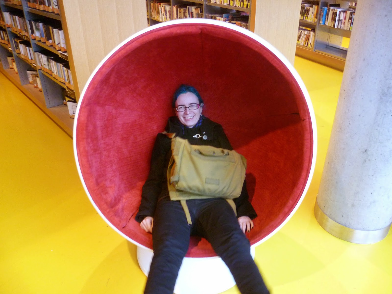
Wednesday, June 24, 2015

Shrewsbury Library


At Christmas time I visited my parents in the UK. While there I decided to check out their local library.


It was in a pretty cool old building, and had this rad statue of Charles Darwin outside. Unfortunately, it was closed on the day I went to visit.


They did have this neat sundial on the side of the building though.

Friday, June 19, 2015

YALSA top ten GNs 2012: Thor: The Mighty Avenger


Thor: The Mighty Avenger (Volumes 1-2) 
Written by Roger Langridge. Illustrated by Chris Samnee
Published by Marvel (Volume 1, 2010; Volume 2, 2011)

So first, a confession. I didn't actually reading the two volumes that were placed on the YALSA list from this year. Instead I read Thor: The Mighty Avenger: The Complete Collection published in 2013. It has all 8 issues of Thor: The Mighty Avenger (plus the Free Comic Book Day story), but doesn't include the old Journey into Mystery issues (#83-86) that are included in the original collections. I'm pretty sure their inclusion didn't affect these books making it onto this list, but feel free to say otherwise.

Despite all the positive things I'd heard about this book, I went in with low expectations (though why I felt that way I couldn't really tell you). Maybe I'd just read too many YALSA top ten books that I didn't really care for (it looks like I've disliked, the last five I reviewed for this site). However, I was pleasantly surprised. This book is really cute and fun! It is, to my surprise, much more romantic than I would have thought a Thor comic would be. Jane Foster (that's her on the cover up above) works in a museum, and ends up helping Thor when she thinks he's a hobo (with a heart of gold). Soon he's sleeping on her couch and there's an amount of crushes and flirting and stuff that is sweet without it making me completely uninterested.

That's not to say it's not a superhero comic. While it's not set in any version of the Marvel Universe that exists anywhere else (that I know of) characters like Iron Man, Namor, and Captain Britain show up, and Thor fights robots and super villains and giant sea monsters. So it's pretty typical in that regard, but I also found it more enjoyable than a lot of the superhero comics I read.

Chris Samnee is an artist a lot of people really like (he won an Eisner award for his work on this series), but the limited stuff by him that I've read hasn't really clicked for me. In this book I can definitely see why people enjoy his work, as a lot of the art is great! But then the next panel will just be unappealing to me for some reason I can't put my finger on (the inking style? The width of the lines?). I wonder if it might be something to do with the way the line work interacts with the colours. The colours (by Matthew Wilson) are generally really good, though as with pretty much all modern books the colours are far more than just flat colours, but are used to give depth, hightlight physical features, and more. I wish I could see some of the original black and white line work and compare the two to see where my problem comes from. Regardless of my feelings, you do at least get to see Thor wearing an apron after cooking a meal.

The most frustrating thing about this series is the fact that it doesn't actually end. Apparently it was intended to be a 12 issues series, but it was cancelled after issue eight, leaving readers to wonder who the mysterious Mr. K was, why Thor got banished to Earth, and other questions. The only thing we do know (based on the sketches in the back) is that Hulk was going to show up. The series was successful enough in collected form that it got reprinted, so it's too bad Marvel didn't put out a four issue miniseries to wrap things up.

Monday, June 1, 2015

YALSA top ten GNs 2011: The Zabime Sisters


The Zabime Sisters
Written and illustrated by Aristophane
Published by First Second (2010)

If I were to pick three things that help make a book more likely to be selected as one of the YALSA top ten graphic novels for teens they would be:
  1. Is about teenagers
  2. Features females in prominent roles
  3. Features minority characters in prominent roles
(A fourth might be "isn't a superhero comic".)

This might make me seem a little jaded about reading these comics, but one of the reasons I started reviewing all of these books was to find out why they ended up on these lists. I think the importance of the YALSA lists are not that they are a "best comics" list, but that the are a "for teens" list. They usually include characters in that age group, and frequently feature characters from groups generally under represented in fiction. This helps provides teenagers both with characters they can more strongly identify with and helps expose them to lifestyles and viewpoints they might not be familiar with.

From the cover of The Zabime Sisters you can see that it fulfills all the "rules" I mentioned above (including the fourth one!), and seems like an obvious candidate for inclusion on a YALSA list. However, I found it incredibly boring.

This is not to say it's bad, just that the subject matter didn't appeal to me at all. The story takes place over a couple of hours in the morning on the first day of summer vacation (which is another recurring theme in these stories...) on the island of Guadalupe (a small island in the Caribbean that is part of France). Now, just to clarify, the reason this didn't appeal to me is not because it was set in the morning, a place I rarely tread by choice, but rather because I thought it was really dull. So dull that it took me a couple of days to read this (quite short) book, and so boring I avoided even writing this review until it was either do this or do homework.

So yeah, a bunch of kids walk around and talk about stuff. Some of them have a picnic thing (and then get drunk off panel), some of them steal mangoes, and a couple of them get into a fight. To me "nothing" happens, and I think that's bad. But other people clearly feel that a book that manages to create a sense of place can be a success, and I assume that is one of the reasons that people enjoyed this story.

Artwise I think the style that Aristophane uses is different from what many people may expect from comics as it's all strong, thick, black lines, with no shading or colouring. Reading some other reviews online indicates that some people didn't like it. I had no problems with the art, and looking at some of it again I feel that Aristophane seems to be capturing the feel of both the characters and the setting welll. The lettering, on the other hand, really, really bugged me.

It's rare that lettering is really discussed in comics. It's kind of the invisible art, only noticeable when someone think's it's bad. And dang, I think it looked really terrible in this comic. Somehow, despite it being hand lettered, it appears to capture every element of terrible computer lettering that I dislike: weird placing of text within speech balloons and caption boxes, text that changes sizes just so that it can fit inside those boxes, the letter i is dotted even though every letter is a capital. It just seemed like a perfect storm of ugly. I assume some of this happened because this book was originally published in French, and so the letterer is stuck with the original spaces and has to make the text fit inside them, but dang, I think they did a really awful job of it.

Next up: Superhero comics. I'm sure I'll like those more.

Saturday, May 9, 2015

YALSA top ten GNs 2015: In Real Life


In Real Life
Writing and illustration by Jen Wang. Original story written by Cory Doctorow.
Published by First Second (2014).

This is only Jen Wang's second graphic novel, but based upon the quality of her illustrations, I really hope it's not her last. Her characters are deeply expressive, and Wang is capable of showing how they're feeling through their facial expressions and their body language. Even without dialogue you're able to know exactly how the various characters feel just by looking at how they're acting in the art. She's also able to show action in clear and exciting ways, both through what the characters are actually doing, the panel-to-panel storytelling, and the general layout of the page. Wang breaks panel borders (at times doing away with them entirely) and uses white space incredibly effectively to help create an atmosphere that captures the feelings of the characters and the world(s) in which they live.

But the thing that truly stands out is the colouring. In Real Life alternates between the real world, and the world of an online MMORPG called Coarsegold. Wang has chosen to colour each of these sections with distinctive colour palettes. The real world sections feature a more sedate style of colouring, with lots of browns and oranges. The online sections feature considerably more colours: pinks, greens, blues, purples, reds. The comparison between the drab "real world" and the more exciting and beautiful game world really help to show that to Anda, the main character, the game is considerably more exciting than real life. It's kind of interesting that seemingly the only time that blue, one of the "game colours", is used in the real world, it's used on the shoes of the person that introduces Anda to Coarsegold in the first place.

However, while I really enjoyed the art, the story pretty much left me cold. It's view of gold farming, labour abuses, online bullying, and other aspects of MMORPG culture are fine, it's just the way in which they're communicated to the audience that I had a problem with. I guess I should say I'm not really a fan of Cory Doctorow's fiction. I like that he's a major proponent of the Creative Commons and digital rights, and that he regularly talks about other important aspects of the digital culture and economy. He's also pretty great at telling people about other things (politics, culture, etc.) through BoingBoing, which I used to read pretty regularly (and still look at occasionally). But I think the only thing he's written that I've read all the way through (apart from blog posts) is Down and Out in the Magic Kingdom (his first book), which was fine I guess (though I'm still puzzled as to why anyone would care about Disney World that much). I've tried reading at least one of his other books, but there's something about his his style of writing that I find unappealing. That continues with In Real Life, which he didn't even write! (Instead Jen Wang adapted a short story that Doctorow wrote over a decade ago.)

I can see why you would choose this book for a YALSA list: it has teenage characters doing things that they care about (playing video games!), it has females doing computer stuff, it exposes people to other people from other cultures, it teaches them about aspects of games, online society, and economics that they don't otherwise know, and the characters have realistic body types. But at the same time, it seems incredibly simplistic, kind of promotes slacktivism at its worse, and the end is a little too "happily ever after" for the types of stuff (Chinese people working 16 hours a day so rich people can buy things in video games) the story talks about. As a 13 year old I probably would have found this book to be really cool, and taught me a lot about things I didn't realize were happening online. As a 31 year old...well, it has really nice art.

If you want to take a look at the comic, here's a preview and here's an original story set after the events of the book (I think). It's probably kind of gibberish if you're not familiar with MMORPGs, and (at least part of) the moral seems to be "if your bicycle is stolen it's okay to buy a stolen bicycle", but the art's nice at least.

Saturday, May 2, 2015

YALSA top ten GNs 2010: Children of the Sea Volume 1


Children of the Sea Volume 1
Written and illustrated by Daisuke Igarashi.
Published by Viz (2009)

Ruka is a girl who is slightly too violent at hand ball. Not violent enough to be kicked out of school or get in any serious trouble, but violent enough that she's not allowed to play with the school team all summer. It's the first day of summer vacation, but fior Ruka it feels as though it's already over.

Ruka's parents both used to work for the Tokyo aquarium, but they've split up and now only her dad works there. Ruka lives with her mom, who drinks a lot of...alcohol? (It shows her drinking cans of something, but it's not translated or explained, so I can only guess that she's drinking beer. I mean, it's probably beer, I'm not sure why they'd show piles of cans in the garbage otherwise. The translator's notes in the back of book "helpfully" point out that people recycle cans in Japan.) Ruka doesn't seem to have the best relationship with either of her parents, or any of her classmates at school, and she's looking at a pretty lonely summer until she encounters Umi and Sora.

Umi and Sora are kids who can swim really well and spend most of their time in the water. They were apparently raised by dugongs (those weird sea cow things) for the first few years of their life, and are "prone to dryness" (e.g. they need to be soaked in water a lot). It's a mystery where they came from, or how they ended up being raised by sea mammals, but they've turned into normal(ish) kids. Umi and Sora feel like they have some sort of connection to Ruka, though as they're don't know their origins, they can't really explain what it is.

So that's the main plot of the comic right? Finding out what the deal with these kids is? That's what I thought until I read the description on the book flap. It says that this comic is about "the mystery of the worldwide disappearance of the ocean's fish", which isn't something that gets introduced in the (300 page) first volume. Because of that I'm left to wonder what this book is even about. Is that description accurate, and the mystery will be brought up in later volumes? Or is it wrong and the plot is "who are these weird kids who were raised by dugongs?". I'm not sure if I'm interested enough to find out, but I think that this sort of book could definitely appeal to teenagers (which is what the YALSA books are for). It's about outsider kids, loneliness, broken relationships, and mysteries. What's not to love?

Daisuke Igarashi's art kind of reminds me of a cross between Moyocco Anno and Taiyo Matsumoto, and while that at first sounded kind of strange to me, all three artists are listed on the Wikipedia article for La nouvelle manga (probably due to their inclusion in Japan as Viewed by 17 Creators) so they have at least one thing in common. (Oh wait, here's an interview where Igarashi says to Matsumoto "I actually read your work just to steal [your ideas]".) The storytelling is generally clear, and there are some pretty cool drawings of aquatic animals.

I don't read that much manga anymore. That's kind of relative I guess, I've read thirty something volumes of manga so far this year, but to be honest that pales in comparison to the other comics I've read (somehow I read 56 graphic novels in April) _and_ is the result of me trying to read more manga. But I used to read a lot _more_ manga than I do now. Either way, I am at least familiar with manga as a medium. Somehow, despite that, I still frequently seem to forget that the pacing in manga can be completely different from western comics. Case in point, Children of the Sea takes 70 pages before it introduces Umi (and Sora takes even longer).

It's kind of funny that the last thing I reviewed was Rust Volume 2, which was another comic that I described as slow, but unlike that one things do actually happen in Children of the Sea. Characters are introduced, events occur. There's no 60 page robot fight scene, but there's also no people discussing farms. So really, on that level alone I have to call it amazing.

Saturday, April 11, 2015

YALSA top ten GNs 2014: Rust Volume 2

 
Rust Vol. 2: Secrets of the Cell
Written and illustrated by Royden Lepp.
Published by Archaia (2012).

It's strange for just the second volume of a series to make it onto the YALSA top ten GNs list. In fact, the only two other examples of non-first volumes making it onto the list are Bad Machinery Vol. 3, from this year's list, and Runaways Vols. 4-6 in 2007 (and if volume 4 of Runaways was released today it would probably have been called Volume 1, as it collected issues 1-6 of volume 2 of Runaways. Yes, comics numbering is stupidly confusing).

Rust is about two things, one is a thing I love, and one is a thing I really don't care about at all. The thing that I love is robots! Yeah! Robots! Apparently there was some big war in the past and the armies used various types of robots (big robots, little robots, lots of robots) to fight each other. They also used humans, and a bunch of them (including parents of characters in this book) died. Since then things have gone back to normal (or somewhat normal), though there are still robots around and you can reprogram them to work on your farm.

And that is the thing I don't really care about: farms. There is a lot of farming and talking about farms in this comic. However, even when it's a robot fixing trucks or doing stuff with hay I find it boring and uninteresting. Unfortunately (for me) there's quite a lot of that stuff. And by "quite a lot", I mean like seventy pages. Lepp is from the prairies somewhere so he probably has nostalgia for that sort of thing, but it's not something that appeals to me on any level.

However, there is a pretty awesome robot fight that takes up a third of the book. And while I'm not opposed to sixty page robot fights (in fact, they sound great), it seems like it might be more useful to move the plot forward a bit more.

Artwise it's kind of a mixed bag. First if you take a look inside you'll notice that everything is coloured in sepia tones, various shades of yellow and brown. While I thought this worked really well for flashback scenes it seemed a little weird for the rest of the comic unless it's trying to indicate that the area the story is set in is suffering from some sort of drought. Though, considering how much the characters talk about the farm, I'm pretty sure they'd mention that.

As for the actual drawings, the backgrounds are fine, the robots are pretty cool, and Lepp is even good at drawing children (something a lot of artists are bad at). Instead he's bad at drawing adults. The two main adult characters look incredibly weird to me in a "why is your head shaped that way" sort of way. (For the record, they both have weirdly shaped heads, but they are shaped weird in different ways.) To be honest, I don't really think these characters even add that much to the story, and you could probably drop them out entirely, or at least reduce the number of pages they show up on.

It seems strange for me to describe a comic that has robot fights, secret government agencies, and war scenes as boring, but it kind of is. This comic is sloowwww. There are quite a few pages of pictures of wheat or people just standing there or similar things. I totally understand that this is a choice that Lepp has made, but it becomes really hard to recommend a $25 graphic novel when you can read it less than half an hour and not much happens plot wise. I'm used to this sort of pacing from some manga, but they're frequently pumping out five or so books this size a year at much cheaper prices.

A third (and final?) volume of Rust came out last year, but I don't think I'll bother reading it. While I do find some of the underlying concepts in Rust interesting, they way they're told just doesn't appeal to me very much. I think other creators could have taken the same story and told it more effectively in just one volume (or even less!). Still, I can sort of see why this is on a YALSA list, as it shows people that live in a rural area and people who have lost parents (to a war), which are concepts to which you might want to expose young people.

Sunday, April 5, 2015

Birmingham Library

Oops, school takes up too much time. Photos from the new library in Birmingham I visited in December.


Two Fun Manchu books!?


These are all music books.


UK floor names make no fucking sense.


They'd taken this room (the Shakespeare Memorial Library) apart and recreated it on the top floor of their new building.